There are many ways to tell a story, and different mediums can introduce or take away certain storytelling elements. TV and film are able to use one of the most powerful elements around- visuals.
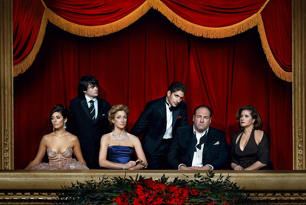
When it comes to effective storytelling, David Chases’ 1999-2007 television series The Sopranos comes to mind. Following the life of New Jersey crime family boss Tony Soprano, his family, and associates, the show is reputed as an achievement of the small screen: there’s an entire Wikipedia page solely for the accolades it has received. Part of the show’s success comes from its numerous, well-thought-out storylines that can focus on topics ranging from mundane to downright disturbing, yet always keep the viewer captivated and attentive. But how does the show tell its stories so well?
The shorter format of TV programs compared to movies means that every second of runtime is valuable for communicating the story, the characters, and the setting to the viewer. Though this time constraint could be seen as a negative by some, skilled directors like Chase make up for it by using visuals to get as many details across as concisely as possible. Sometimes, this visual communication can be overt and hard to miss- an example would be when Tony witnesses the ghost of “Big Pussy” in a mirror, symbolizing that he feels guilt for killing his longtime friend. However, in my opinion, the most nuanced and carefully thought out way that The Sopranos visually tells its stories is through the use of color.
Colors inherently have emotions, which are used to dramatic effect often in visual media. Black is normally associated with sadness or gloom, red tends to represent anger, white is seen as the opposite of black, and so on. This is common knowledge, but colors really start to tell a story when they are dynamic. When considering the power color has in this context, it becomes more clear how aspects like changing colors, shades of colors, the number of colors, how they interact with each other, and even a lack of color can change or strengthen the way stories are told. The Sopranos uses all of these aspects and more, and they serve to make its storytelling that much more effective throughout the course of its six seasons.

In the opening season, released in 1999, the colors used are bright, vibrant, and contrasted with each other. The striking greens and browns of grass and nature are shown frequently, perhaps more than in other seasons, but definitely more colorful. It is often daytime, and the weather is bright and sunny in almost every outdoor shot- even indoor shots are well-lit and distinctive. There are occasional uses of darker, gloomier shots, especially when murder or crime is being committed (i.e. Christopher shooting Emil in the first episode), but for the most part, the first season is very light in terms of color.
This fits the tone of the show at the time- it was still a serious crime drama, but the mood was more akin to a darker version of a sitcom. Characters, who obviously looked the youngest in Season 1 than any other season, dress in flashy outfits and talk in flashier lingo as they are established as anti-heroes: bad guys you can’t help but root for. Of course, it wouldn’t be a drama without more serious moments and tension, like when Tony is almost killed by two hitmen sent by his mother and uncle- even in scenes like this though, the vibrant orange of Tony’s juice, his light green shirt, the bright color tones, the sun-soaked street… they all combine together in tandem with the cheerier storytelling time to create a kind of aloof feeling. Our characters seem pretty well-off, whatever trouble they do have isn’t taken too seriously by the viewer, and everything seems pretty bright and cheery. But it doesn’t stay like that for much longer.
By the final seasons, 6A and 6B, the sobering effect continually brought on by the colors reaches its logical conclusion, and there is a noticeable change in colors and the ways they are used. By sobering effect, I’m referring to the change in tone brought about by the end of the series. The cheerfulness and feel-good moments are all but gone, characters have been killed, lost their families, and the remainders seem like a shell of their old selves. The New Jersey and New York families, normally allies and even friends with each other, are now in a full-scale war, with most of the friends-in-common being dead or turned against each other. With dialogue and action alone, this ending could’ve been brought to life- that’s how powerful the acting and directing are. But it wouldn’t be David Chase without more, and the aforementioned colors assist in delivering this downright depressing finale.
Shades of gray, muted blues, and neutral colors, in general, are used frequently in Season 6, a far cry from the bright brights from before. Characters are often lit in a way that shades over their eyes, giving the feeling that they’re almost losing their soul. These are not the same men and women from the beginning, and going over their character arcs, their Season 6 renditions make their early appearances seem even more cheerful. A good example for just one of these characters is Uncle Junior, so full of life and gusto in the earlier seasons, yet reduced to a dying mental patient who can’t remember his own nephew. Again, the colors change accordingly- Junior’s last scene takes place in a psychiatric facility, with artificial hospital lights making him look even more sickly, an overcast day outside, and shadows extending throughout the room. The colors match the tone, and the continuous decrease in positivity means that the light and vibrance are gone- now, it’s dead, dark, diseased.
In the very last scene of the show, an ending that is still debated to this day, the screen cuts to black just before we can see who Tony was watching enter the diner. These final frames of darkness encapsulate what the changing colors used were all about: the slow decline of Tony’s lifestyle, as things gradually get worse and “darker” until there’s literally nothing left to show. Even if this doesn’t signify Tony’s death, which I disagree with, it at least signifies that these characters can never go back, that everything has gone bad, and that the colors will never be as bright as they used to be in this fictional world.
To summarise, The Sopranos uses color in storytelling to do two key things: to independently establish the tone and mood of the scene(s) they are being used in and to signify that the tone and mood are becoming more negative as times goes on and these colors change. It has to be one of the most effective and creative uses of color in media that I’ve ever seen, and for me, is just another reason why the show is so great.
1 comment
I’ve never thought about the use of color in The Sopranos before. Maybe it’s a sign I should rewatch it.